Imagined worlds - Final composition
Next in our imagined worlds task we had to create a basic composition of our work.
For my project out of my thumbnails I choose the futuristic London although I did make some changes as detailed below.
Here is my basic composition of London, here is my horizon line to show where to cut off the buildings. On the far right building there is also a feint red circle that would help with the perception too.
Next I added more buildings to show more depth and also changed the clock faces on Big Ben to a darker shade as it gave more glow to the clock lights which I will show next.
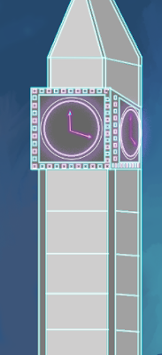
Here is my clock face with the different color background on the tower, as you can see with the dark background the handle and circles are much more vibrant and glow more because the colors are quite the opposite of each other.
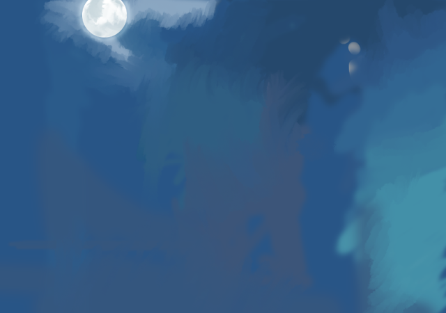
Next I made the background, I thought that I wanted the scene to be much more vibrant than my thumbnail, so I removed the smoke completely but still wanted some resemblance so I made it a nighttime scene. This means that all of the lights would have more glow. Firstly I made the moon, I did this by adding a glow vfx to a white ellipse, finally I added grey and used a mixture of tools to give it the moon texture. I am very happy with how it turned out.
Next I continued with the background using many different shades of blue with different tools. I put a white glow around the moon and on make the blue slowly fade to a lighter color on the right. I left the middle relatively untouched because there will be buildings in the foreground.
Now I decided to experiment with different lighting. My first was lots of pink and blue neon lights, although I didn't think it was bad being the only part of Big Ben that lights up, the clock compartment It didn't give a big enough presence for the rest of the building.
For my next set of lights I decided to do a pink and blue neon outline which was simple but effective, after further inspection these colours clashed so I made the outline blue only with the clock highlights to be pink.
Finally I decided to actually merge these concepts as they were much stronger together, the outlines help define the whole building while the cubes around the clock stop it from being too basic.
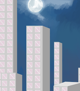
Next I added windows to my buildings, the window shape was originally a concept for my lighting of my tower but I decided they looked pretty nice as windows so I kept them
To show more depth some of the windows are bigger or smaller, this gives the scene a bit more life as the windows aren't all the same size or amount on each building.
Next I added drones onto my scene instead of the airplane from my concept, I felt this worked a lot better with my synoptic project as we had drones in our shots but no airplanes. I made the model on Maya and brought it into Photoshop, here I colored it and put it into my scene.
I also added a second robot to add more to the scene and make the initial robot look less like an anomaly.
I decided to add scanner lights to the drone as this makes them seem more devious and give a bad vibe from them along with their red eyes. I made the first scanner red to indicate that the drone has found something in the building and the other scanner green as it is a passive color.
Here I added a glow onto the sides of the building
In conclusion I think that this turned out pretty well from the first thumbnail, I managed to keep the idea behind it while removing the plane completely and replacing it with drone which felt more relevant. I also did make an animatic for this which again was done on a different blog post.


Comments
Post a Comment